
How to Create a Standout UX Portfolio Presentation and Choose the Best Platform
Most Jr UX designers I talk to are so busy agonizing over their portfolio that the presentation part (the one they’ll actually have to give in an interview) becomes an afterthought.
In this guide
I’ll walk through the POSTER framework for structuring your slides, compare the best platforms for building your deck, share how I presented my Clinical case study at Veeva, and cover how to tailor slides for each interviewing panel.
I did the same thing. I poured weeks into building my portfolio, then realized the night before an interview that I had no idea how to walk a panel through my UX portfolio presentation in 15 minutes.
I spent that night frantically rearranging slides like a cat chasing a laser pointer. Lots of movement, zero progress.
The portfolio got me in the door. The presentation was what I needed to get the job, and I had nothing ready.
The expectation in UX interviewing hasn’t budged: you will be asked to present and defend your case studies in front of a room of people. A solid case study presentation can be the difference between an offer and a polite rejection.
Even as a former technical recruiter, I knew this was the standard. The designers who prep for that moment are the ones who walk out with offers. The ones who wing it are the ones sending the follow-up email that starts with “I wanted to circle back…”
Completing my new portfolio was just the first step in a much bigger mountain of securing a new role.
Without a Case Study, You Can’t Have a Presentation
There’s a common misconception that only shipped work is valuable and portfolio-worthy.
I don’t think that’s true for every case.
Shipping a project is the goal, sure. But it’s a team sport involving an entire organization.
I’ve run UX research studies and designed screens that never made it to production. That doesn’t make the work worthless.
What matters is whether you can talk about what you learned, what you’d do differently, and what constraints you were working under.
That said, you can’t build a presentation without a case study to present. If you don’t have one yet, start there.
If you’ve got a draft that still reads like everyone else’s, here’s how I fixed mine. The presentation part comes after.
The POSTER Framework: Your Case Study Presentation Backbone
I went to a virtual UX meetup not long ago where Dr. Ari Zelmanow introduced a framework called POSTER for building case study presentations. Dr. Ari has years of experience at influential companies and had hundreds of slides he could pull from to answer nearly anything a panel threw his way.
Naturally, everyone in the audience had the same question: great, but what if I don’t have 10 years of projects? POSTER works because it gives you hard boundaries that keep you focused, whether you’re working with one project or twenty. Each letter is one slide or section in your portfolio presentation structure.
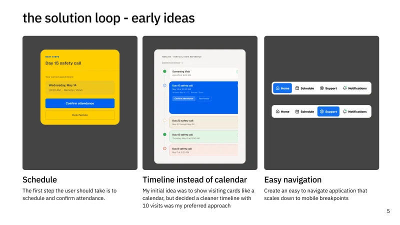
I’ll use my latest case study presentation, Clinical, as an example for POSTER. I had to give this presentation for my interview with Veeva, a healthcare software company.
I had a 45-minute window to present and defend my work in front of a panel of four people. The panel included the design lead, a product manager, the VP of Design, and a Sr. Product Designer.
Knowing your audience is the first key. You can make a lot of safe assumptions about what a panel will care about, but the only way to know for sure is to ask questions and pay attention to what comes up in earlier rounds.
The stack I used:
- Slides were built in Figma Slides
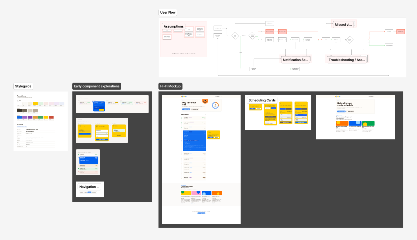
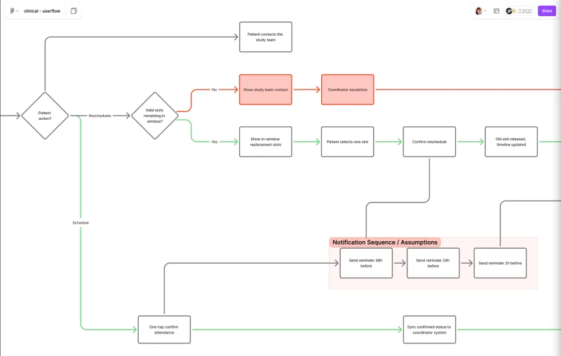
- Workflow diagrams built in FigJam
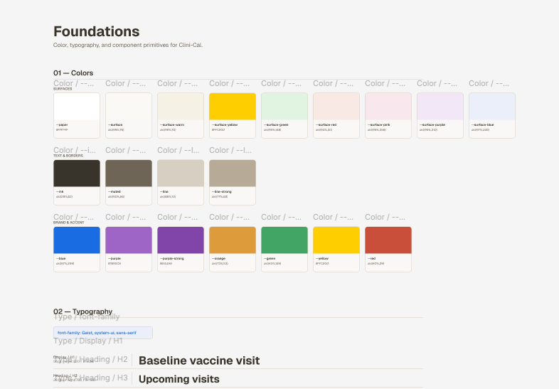
- Frames were built in Figma
- Live prototypes built in NextJS + Claude Code
The whole presentation flow went like this:
- Start with the slides: 4 slides of actual content, 1 for intro, 1 for closing. Slides were light. Enough to introduce the topic. I had copious speaker notes for each slide so I could talk through the details without cluttering the visuals.
- Once the slide presentation was done, I presented the Figma static frames to the panel. I walked them through each frame of my solutions.
- After the static frames, I presented the live prototype built in NextJS + Claude Code. I walked them through the flow and interactions, showing how the solution worked in practice.
- I also had a live version of the prototype they could interact with using Wiremaven tunnel. This let the panel explore the prototype on their own, giving them a hands-on experience of the solution.
Problem: State the problem you set out to solve, in one sentence, on one slide. What was broken and who was it broken for?
Don’t over-explain. The panel needs to understand the stakes, not read a dissertation.
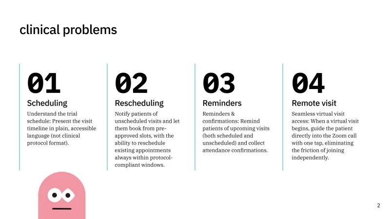
Outcome: What happened as a result of your work? Quantify if you can. “Reduced task completion time by 40%” is stronger than “Made the flow better.”
If you don’t have hard metrics, describe the shift in user behavior or business impact. This is your north star. Everything on subsequent slides traces back to this outcome.
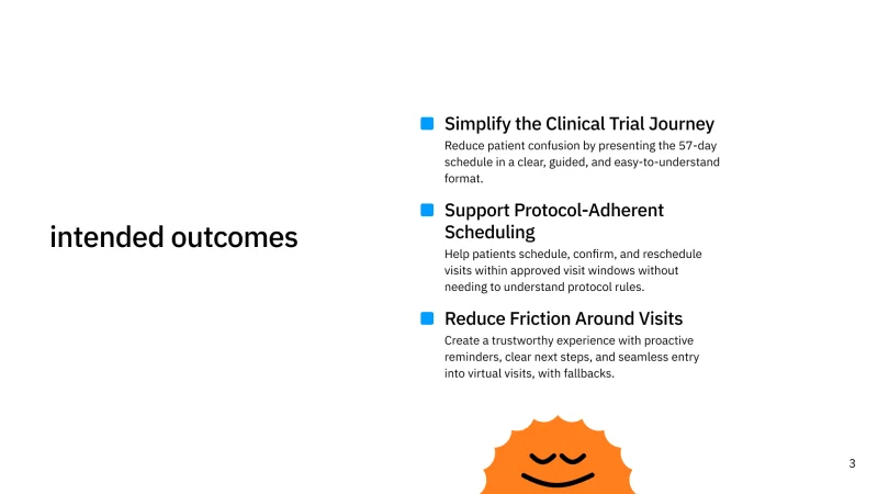
Solution: Show what you built. Lead with the final design, not the iterations.
Panels want to see the destination before they care about the journey. One or two hero screens, cleanly presented.
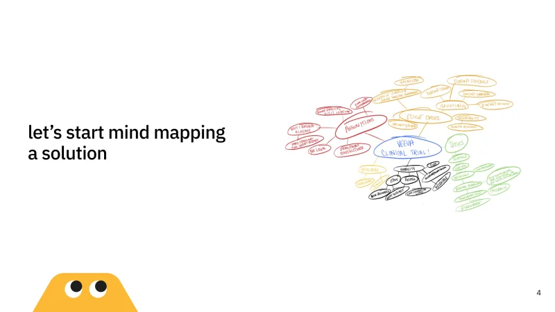
Tactics: How did you get there? This is where your UX process lives: research methods, competitive analysis, usability testing, iterations.
Pick the two or three that mattered most. You’re not trying to prove you did every possible method. You’re proving your decisions were intentional.
Evidence: Remember all those artifacts I told you to leave off your portfolio case study? This is where they earn their keep.
Sketches, wireframes, card-sorting results, survey data. Anything that shows your work was grounded in something real.
Be picky. Every artifact on that slide should be pulling its weight.
Risks: What trade-offs did you run into? What assumptions did you have to make?
Panels respect designers who know what they couldn’t solve and why. A slide that says “Here’s the constraint we hit, and here’s how we worked around it” tells them more about your maturity than pretending the project was flawless.
Building a case study presentation is an iterative process, like everything else in design. POSTER gives you a starting point and enough structure to stay on track.
For ux case studies for beginners especially, having a clear framework removes the guesswork of what to include and what to cut. Go give Dr. Ari a follow if you’re interested in learning more.
Best Platforms for UX Portfolio Presentations
Whether you call it a portfolio presentation or a project presentation, you need a platform you can move through without stopping to think. The tool should disappear so your story can show up. Here is how the four leading platforms shake out.
Figma Slides (“Flides”). Native to the design tool you’re already in. Copy-paste frames directly, keep your design fidelity, no export-import dance.
The downside: it’s still maturing. Animations are limited. Speaker notes work but feel bolted on.
If you build your case studies in Figma, Flides is the path of least resistance.
Google Slides. The boring choice, and that’s why it works. Zero learning curve.
Real-time collaboration so a friend can drop feedback while you edit. Offline mode saves you from unreliable conference Wi-Fi.
The catch: you’ll be exporting images from Figma and placing them manually. Every design change means re-exporting. It adds friction.
PowerPoint. Deeper animation controls and better presenter tools than most designers give it credit for. If you’re presenting to enterprise stakeholders, they expect it.
The presenter view with notes, next-slide preview, and timer is genuinely useful. Same cost as Slides: manual image exports. The ribbon UI is a lot if you haven’t touched it since college.
Canva. The fastest path to something that looks polished with zero effort on the deck itself. Templates are strong. But you’re still exporting and placing images, and the brand-kit features that make Canva shine for marketing teams don’t matter much for a three-slide case study walkthrough.
One wrinkle nobody warns you about: some recruiters and applicant-tracking systems ask for a PowerPoint file specifically, even after you’ve built the whole deck in Flides. Figma doesn’t export straight to .pptx.
Your options are a Figma-to-PowerPoint plugin (fonts substitute, spacing shifts, expect a cleanup pass) or the blunt-force fix: screenshot each frame and drop the images into a blank PowerPoint deck. Neither is elegant. Both get you a file you can email five minutes before a panel.
The honest answer: use whatever you already know. Comfort wins over features.
My own stack for the Veeva interview was Figma Slides for slides, FigJam for workflow diagrams, Figma for static frames, and a live prototype in NextJS and Claude Code, because I was already living in Figma and didn’t want to export 40 frames by hand.
If you’ve spent years in Google Slides, stay there. A well-told story on any of these platforms beats a mediocre one on the “best” tool.
What to Put on the Page (and What to Leave Out)
The golden rule of presentations: short copy, presenter notes for the detail, let visuals carry the weight. Your slides are a backdrop, not your script.
If you’re using POSTER, your artifacts live in the Evidence section. Don’t dump everything in. Pick the ones that move the story forward.
Sketches to wireframes to hi-fi mockups show how your thinking progressed without a single word. A competitive analysis chart or a usability test quote makes your decisions feel grounded, not arbitrary.
A panel remembers one compelling visual and three bullet points. Nobody remembers walls of text. If you’re stuck on layout, browse a few ux portfolio presentation examples for inspiration, but don’t let someone else’s structure override your story.
Should You Tailor Every Presentation?
A LinkedIn post crossed my feed recently telling designers to stop using the exact same presentation for every interview. The argument: you should tweak your slides to highlight what each role cares about most.
I agree in spirit. But in practice, you’re up against real constraints from day one.
The job description, the recruiter, and the hiring manager can all disagree about what’s important. I once got through three rounds of a four-round process before anyone mentioned the role lived in the company’s mobile division.
My most recent case study? Not mobile.
I had two options:
- Dust off an older, less polished mobile project and build a presentation around it.
- Take my strongest work and adapt it to speak to universal business challenges.
I went with option two. I focused the presentation on how my solutions applied to broad problems regardless of platform. The result was a tighter, more confident presentation, and the panel understood my reasoning because I walked them through the decision using the POSTER structure.
Catering Doesn’t Mean Starting Over
Small, targeted changes go further than people admit. Portfolio presentations almost always happen in a team or panel interview, so your real job is to understand what matters to the people in that room.
Two things help:
- Ask questions before the panel interview. What does this team care about most?
- Pay attention to what keeps coming up in earlier rounds.
During your recruiter screen: which parts of the job description did they highlight? During your design lead conversation: what problems did they circle back to over and over?
Those are your signals. Follow them.
In one recent interview, it became obvious early that the company’s core values were a big deal to them. So I quietly worked the acronym for their values into the corner of my opening slide, then dropped the matching value onto each subsequent slide.
Nobody mentioned it out loud. But they noticed.
Starting Is the Hardest Part
I know it’s overwhelming to think about covering everything a panel might ask. I promise you: build your presentation early, while your case studies are still fresh in your head. It’s so much easier to organize your thoughts now than to panic-assemble something the night before.
Here’s what I wish someone had told me: your presentation isn’t a documentary. It’s a trailer.
Every slide earns its place or it gets scrapped. POSTER gives you the filter, so use it.
If you want a preview of what’s actually running through a reviewer’s head before you ever get to a panel, here’s what I check when I’m the one screening portfolios.
The people across the table aren’t looking for a perfect project. They’re looking for a designer who can think clearly, explain their decisions, and tell a story that makes them want to see what’s next. If you can do that, they’ll lean in.