
What Is Vibe Coding? A Beginner-Friendly Primer for Designers
The gap between describing a thing and the thing existing is the entire story of vibe coding.
It’s also why almost every designer I know who’s tried it describes the same two-part reaction: unsettled, then hooked, in that order.
“Vibe coding” is a specific, dateable term. Andrej Karpathy, an OpenAI founding member and Tesla’s former AI director, coined it in a tweet on February 2, 2025:
There’s a new kind of coding I call ‘vibe coding’, where you fully give in to the vibes, embrace exponentials, and forget that the code even exists. I just see stuff, say stuff, run stuff, and copy paste stuff, and it mostly works.
Andrej Karpathy, February 2, 2025
He was describing weekend, throwaway projects, and the gap between that and production software matters more than it sounds. The “just go with it” version of vibe coding is exactly right for a first prototype and exactly wrong the moment something needs to hold a real user’s data.
Designers are unusually well positioned for this. The two things vibe coding actually asks of you, describing an intended outcome precisely enough for someone else to build it, and critiquing the result against that intent rather than against “is this technically correct,” are things designers already do for a living. A prompt is a brief. Reviewing what the AI generated is a design review: the same motion as looking at a junior designer’s first pass and saying what’s off and why, as Stu Green argues in his crash course for designers.
But here’s the actual gap. Every “designer’s guide to vibe coding” I found assumes you already know what git is and already have opinions about component libraries. Every true-beginner tutorial is written for a generic user with no design background, so it skips the parts that would click for someone who thinks in tokens and comps. This isn’t a guide. It’s the primer I wish had existed before I sat down to build Clinical: zero assumed technical fluency, walked through an actual designer’s workflow, enough to get you to a first prompt and a published app, not enough to make you an engineer.
In this post
I’ll cover what vibe coding actually means, which tool to start with, how to write and fix your first prompt, how to get something live, where Figma MCP fits into the workflow, and the project that made it click for me.
What vibe coding actually is
Forget the dictionary definition, you already have it. What actually determines whether you get back something great or something generic is context. Vibe coding is handing the execution layer, Claude Code, Codex, Cursor, whichever one is doing the building, enough of the right information to produce the outcome you’re picturing instead of the outcome it’s guessing at.
Too many designers skip that part and then blame the tool. “Build me a login page” tells an AI almost nothing: what the data actually looks like, who’s allowed to see what, what happens on a wrong password, what this app is even for. Left with that gap, it doesn’t stop and ask.
It guesses, confidently, and hands you back the statistical average of every login page it’s ever seen.
You already give this exact information away for free in a client brief. First time at a keyboard with an AI, it’s easy to forget to bring any of it, then act surprised the output reads generic. Shitty input, shitty output. Every time.
The actual skill under the buzzword is communication. It’s the same instinct behind a good creative brief or a clear design review, aimed at a collaborator who won’t stop to ask a clarifying question before it builds the wrong thing, fast and confidently. The mental model that matters here: vibe coding for beginners is closer to art directing than it is to writing code by hand. This week you’re learning to hand over context precisely enough that something else can build it, and to have opinions about what’s wrong with the first draft. Sound familiar? It should. It’s the job you already have.
Picking your first tool
Pick a tool with nothing to install, because “configuring an environment” is where most first attempts die before a single prompt gets typed. Here’s the full range, from browser-only tools built for a first try to the advanced tools built for people who already live in a codebase.
| Tool | Tier | What it’s for |
|---|---|---|
| Lovable | Beginner | The most consistently recommended starting point for non-coders. Everything happens visually: prompting plus point-and-click editing on top of what it builds. Publishing is one click, with a security scan first. |
| Bolt.new | Beginner | Fully browser-based too, and benchmarked as marginally faster than Lovable for a first visible result. Same one-click publish, different subdomain. |
| v0 | Beginner | Built by Vercel, it started as a tool for generating individual interface pieces. Describe a login form, get one back. Best fit if your instinct is “I just want to see a screen.” |
| Replit | Beginner | One notch up. Still nothing to install, but it shows more of the underlying file structure, useful once “I wonder what’s in there” turns into a real question instead of a scary one. |
| GitHub Copilot | Advanced | Started as autocomplete inside your editor, and now ships an agent mode that plans and executes changes across multiple files. Assumes you’re already living in an IDE. |
| Cursor | Advanced | The tool named in Karpathy’s original “vibe coding” tweet. A full code editor with AI built into every layer, not a chat panel bolted on the side. |
| Claude Code Terminal | Advanced | What I used to build Clinical, the vaccine-trial scheduling app I walk through later in this post, and what I still use now for coding real product prototypes. Terminal-based, no editor required. |
| Codex | Advanced | OpenAI’s terminal-based coding agent, the same category as Claude Code. Point it at a codebase and describe the change. |
| VS Code + Claude Code / Codex | Advanced | The same two agents from the terminal rows, wearing an editor instead. Both ship official VS Code extensions: inline diffs and a sidebar chat panel instead of a scrolling terminal pane, for whoever wants the agent without leaving a familiar IDE. |
| OpenCode | Advanced | Terminal-based too, but provider-agnostic: swap between Anthropic, OpenAI, Google, or a local model instead of being locked to whoever built the tool. |
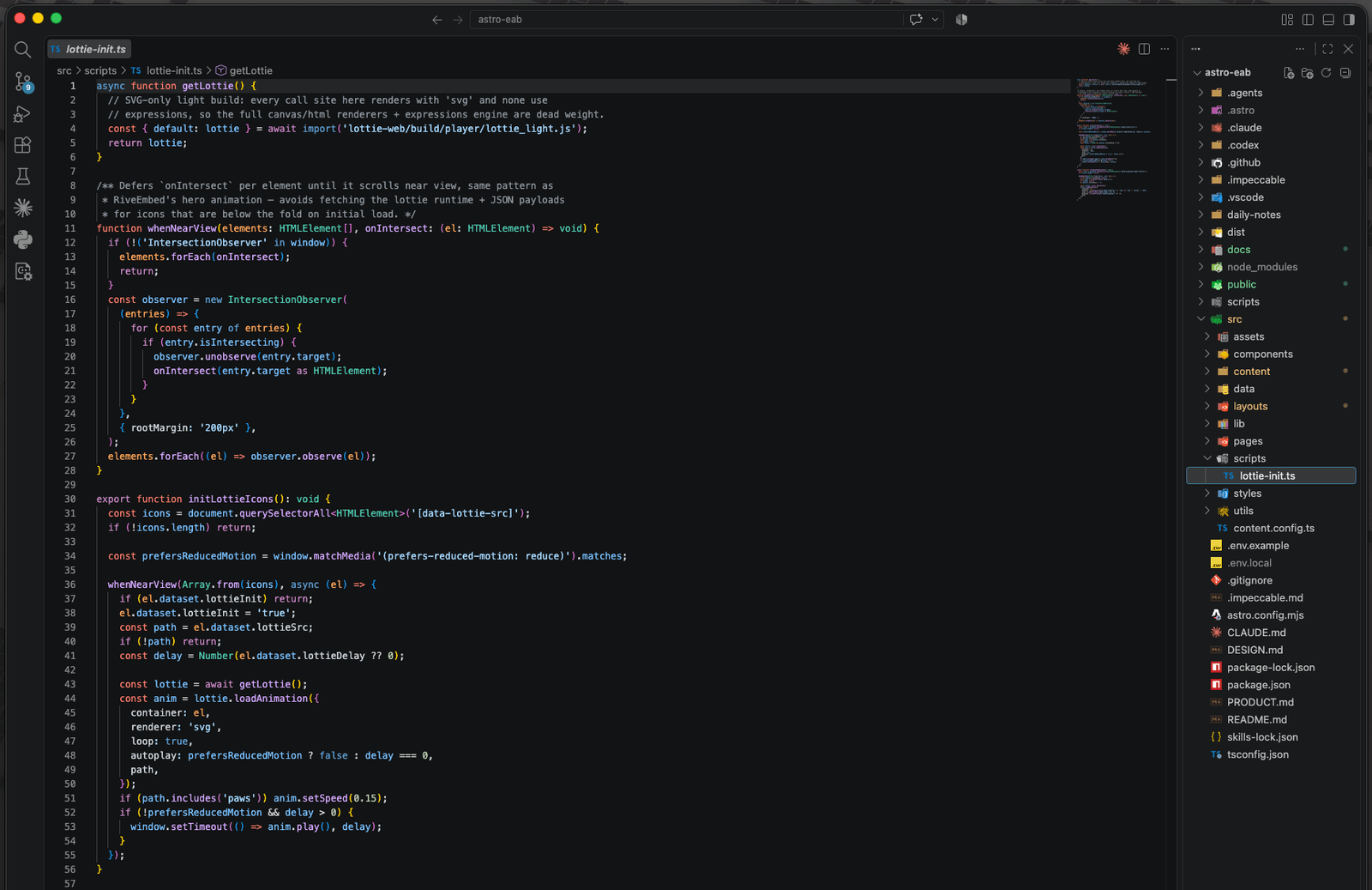
Every advanced tool up there assumes you already know what a file tree is before you type your first prompt, whether it hands you a terminal or an inline diff. Starting there, on your very first attempt, is like handing someone their first camera and opening with manual focus. Get the shot first. Learn the dial later.
So how to vibe code for the first time, in one sentence: pick any one of the four beginner tools above and open it. You aren’t picking wrong. You’re picking a starting point.
Writing your first prompt
“Build me a nice app” isn’t a brief, and the output will look exactly like what a non-brief deserves: generic, templated, the visual equivalent of a default Bootstrap page. The AI has nothing to anchor on, so it defaults to the statistical average of every app it’s seen.
Here’s where being a designer becomes a real advantage instead of a nice narrative: you already default to working from references instead of blank-page description. Use that. “Make it look nice” is a bad prompt. “Match this” is a good one. Paste a Figma frame’s color values, name your actual token names if you have them, describe the vibe by comparison (“closer to a field notebook than a dashboard”) instead of by adjective. You already do this every time you tell a client something sits “somewhere between X and Y.” Do the same thing to the AI.
Be specific about function too: what it does, who it’s for, what makes this different from what everyone else already has. When I built Clinical, the working prompt looked closer to this: every visit needs a computed date, a type (clinic visit or phone safety call), and a specific checklist of what’s due that day, and some of those tasks, like adverse-event reporting, are for site staff only and should never show up on a patient’s view. “Build a visit scheduler” wouldn’t have gotten me there. That’s a brief, the same way “make it look nice” isn’t. The AI can only follow rules like that once you’ve spelled them out. It can’t guess them.
A prompt with a reference frame and a screenshot attached, typed the way it actually gets typed
Build the visit card for the patient dashboard.
Reference figma.com/file/8h3KqZpN2xR/Clinical?node-id=118-56
Attach @schedule-of-events.png for the exact date math.
Card shows the visit type badge (C or SC), the computed
date, and a checklist of what is due. Adverse-event tasks
stay off the patient view entirely.
- 0.4sReading @schedule-of-events.png
- 1.6sPulling spacing and type scale from figma.com/file/8h3KqZpN2xR
- 3.1sBuilding VisitCard.tsx
- 4.6sVisit type badge renders as C or SC
- 4.9sDate pulled from the computed schedule
- 5.2sAdverse-event tasks filtered from the patient view
✓ Built and verified in 5.4s
Then iterate in small moves. If the layout’s right but the button color’s wrong, ask for the button color. Don’t ask it to “make the whole thing better,” because that gives it license to touch the parts that were already working. And watch for the prompt loop: if you’ve asked for the same fix twice and it still hasn’t landed, stop asking a third time. Each repeated “no, fix it” patches more code onto the last failed attempt, and quality drops instead of improving. Close the conversation, start fresh, and describe the problem differently instead of louder.
Here’s the same gap, side by side, in prompts you’d actually type:
| Vague prompt | Specific prompt |
|---|---|
| Make it look nice. | Match this Figma frame: dashed hairline borders, Geist Mono in all caps for labels, one accent color used only on buttons and active states. |
| Build a login page. | Build a login page for a clinical trial app. Email and password, a “forgot password” link that emails a reset code, and the account locks after five failed attempts. |
| Add a scheduling feature. | Every visit needs a computed date, a type (clinic visit or phone call), and a checklist of what’s due that day. Adverse-event tasks are staff-only and should never show up on a patient’s screen. |
| Make the whole thing better. | The save button doesn’t clear the form after it submits. Fix just that. |
| Add some placeholder content. | Use these 12 visit types and their date windows, pulled straight from the actual trial protocol. |
That’s the floor. Once you’re pulling from an actual file, push further. Paste the real Figma link, name the actual CSS properties, describe pixel values instead of vibes.
| Vague prompt | Prompt with real specs |
|---|---|
| Add a hero section. | Hero section from figma.com/file/8h3KqZpN2xR/Clinical?node-id=204-1187. Full-bleed photo, headline set in Geist at 64px, line-height 1.05, CTA button pinned bottom-left with 24px of padding. |
| Make the cards look better. | Cards sit on a CSS grid, repeat(auto-fill, minmax(280px, 1fr)), 24px gap. 1px dashed border, no box-shadow, and a 4px solid accent-colored border-top that only shows on hover. |
| Fix the navbar. | Navbar is position: sticky, top: 0, z-index: 50. The hairline border-bottom sits at opacity: 0 until the page scrolls past 8px, then fades in over 150ms. |
| Add a dashboard. | Dashboard from figma.com/file/8h3KqZpN2xR/Clinical?node-id=311-402. Three stat cards in a flex row, each a fixed 200px wide, then a chart below spanning the full grid column. |
| Make the empty state nicer. | Empty state for zero visits logged: one line-art illustration of a calendar, centered, copy that reads “No visits scheduled yet,” button below the copy, not above it. |
When it breaks, and how to get it live
Something will break. Here’s the sequence that actually works, translated for someone who’s never done this before.
| Step | What to do |
|---|---|
| Reproduce it | Do the exact click, in the exact order, that caused the problem, and confirm it happens every time. |
| Read the error | It looks like nonsense at first. It isn’t. It’s usually naming, almost literally, the thing that broke. |
| Ask for one fix | Not “rewrite this,” which reopens every decision that was already working. “The save button isn’t clearing the form after it submits” is a fix. “Make the form work better” is a new bug waiting to happen. |
| Trace the action | Click, then look at what changed on screen. If nothing changed where you expected it to, that gap is your bug’s real address. |
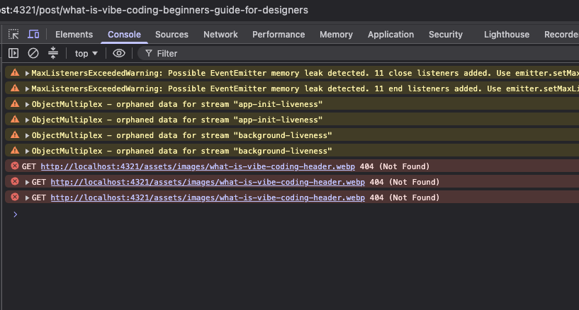
Screenshot the console instead of transcribing it. Most vibe coding tools run on models with vision, so a screenshot of the actual error panel gets you a faster, more accurate answer than you retyping ten lines of red text. A wall of MaxListenersExceededWarning, ObjectMultiplex orphaned data, and Failed to load resource: net::ERR_BLOCKED_BY_CLIENT looks like the whole app is on fire. Most of that is noise, an ad blocker flagging a request, a background listener that’s been there since scaffolding. Drop the screenshot in and ask what’s actually broken. The AI sorts real from noise in seconds.
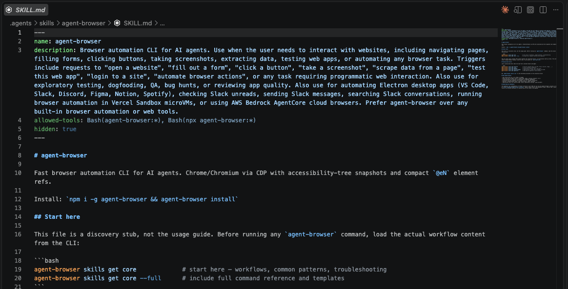
That’s the reactive move, for something that’s already broken. The proactive one: have an agent test the feature before you call it done. Tools like agent-browser drive a real browser, click through what you just built the way a user would, and report back what actually happened. It’s a smoke test, not a full test suite: does the thing you just asked for actually work, right now, in a real browser. Ask for that after every feature that touches the UI.
One honest caveat, because “it works” and “it’s safe” are different claims. Veracode’s 2025 GenAI Code Security Report tested more than 100 large language models across 80 coding tasks and found 45% of the AI-generated code samples carried OWASP Top 10 vulnerabilities, at roughly 2.74 times the rate of human-written equivalents, with larger, newer models showing no real improvement. For a toy project that only you will ever open, that risk rounds to zero. For anything touching real patient data, a real login, or a real payment, that’s the line where “vibe code it this weekend” stops being the whole plan.
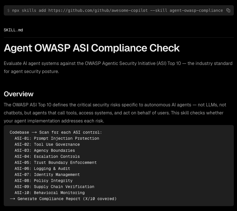
That doesn’t mean becoming a security expert overnight. It means knowing where to look. Agent skills exist for exactly this: agent-owasp-compliance scans a codebase against the OWASP Agentic Security Initiative’s Top 10, prompt injection protection, tool-use governance, trust boundaries, logging and audit, the categories a real security review would flag, and hands back a coverage report instead of you guessing. You install it the same way you’d add any other skill, point it at the app, and ask what’s uncovered.
Where you run it depends on what the app actually is. A weekend prototype you’re using to test whether a design idea holds up, the kind you’ll open twice and then abandon, doesn’t need a compliance pass. Anything a real person will log into, with real data behind it, does. Run the check when the stakes justify it, and skip it when they don’t.
Getting it live, on the browser-only tools, is almost anticlimactic after all that: one button, three flavors of the same click.
| Tool | How you publish |
|---|---|
| Lovable | Click Publish. It runs a security scan first, then hands you a live URL on its own subdomain. |
| Bolt.new | Click Deploy. Same one-click flow, live on its own subdomain. |
| v0 | Click Publish. Same one-click flow, live on its own subdomain. |
No servers to configure, no domain to buy unless you want a custom one later. The distance between “I have an idea” and “I have a URL I can text someone” is just those two clicks: prompt, then publish.
Where Figma MCP fits in
Figma’s MCP server closes the gap this whole post has been working around: pasting a link, describing pixel values, naming tokens by hand. It lets a coding agent harness, Claude Code, Codex, whichever one’s doing the building, query your actual Figma file directly: real frame structure, real variable values, real component names, instead of your paraphrase of them.
The three pieces below aren’t sequential steps you run once. They’re a loop: the harness reads the file through MCP and builds the feature, you review what got built against the file, and that next prompt goes back to the harness, not back to a fresh paste.
Not a pipeline — all three feed each other
Figma MCP exposes your actual file, frames, variables, component names, so the harness and your own review can both check against it directly.
The harness sits at the top: reads the file through MCP, builds the feature, and takes your next prompt when something's off.
The feature ships, gets checked against the file, not your memory of it, and any gap becomes your next prompt to the harness.
The project that made it click
The project that actually made vibe coding click for me was a take-home exercise for a job interview with a clinical-tech company, and the “spec” was a real schedule-of-events table pulled straight from a vaccine trial protocol: which visits happen when, how far each one is allowed to slip from its target date and still count, which ones are an in-person clinic visit versus just a phone call, and exactly what has to happen at each one, from informed consent through the final blood draw.
Nobody simplified it for me first. I got the actual table site coordinators work from. The brief itself only asked for the expected things: hi-fidelity screens in Figma, user flows, documented assumptions, a final design solution.
Turning it into a working scheduling app wasn’t part of the assignment. That was mine to add, because I wanted to walk into that interview with something I knew no other candidate would risk attempting. I called it Clinical.
I’d already been vibe coding for a while by then, so this wasn’t my first sentence typed into a text box. But it was the first time the stakes felt real: a job on the line, a hard four-hour cap to deliver the requirements and the prototype I’d decided to add on top of them, and a table dense enough that half the work was reading it correctly before I ever wrote a prompt.
A four-week window on the screening visit narrows to three days by the middle follow-ups, and by the final visit it’s a specific -3-to-+7 range around a date computed from someone’s actual vaccination day. That’s not decoration. Get date math like that wrong and, in a real trial, a patient shows up outside their visit window.
A simplified version of the kind of schedule-of-events table Clinical had to encode — hover or tap any numbered mark for what it does
Tasks due at each visit
Reflective Coda
Vibe coding closes the gap between the thing you can picture and the thing you can hand someone. It was never about turning you into an engineer. For years that gap was the entire job of prototyping: describe it well in a meeting, mock it up in Figma, hope the built version resembles what you meant. Vibe coding lets you skip the hoping part for small, low-stakes things. That alone accounts for most of what blocks a design idea from getting tested.
The skill that transfers is the one you already have: describing intent precisely, and knowing what’s wrong with a first draft. The skill that doesn’t transfer automatically is judgment about what’s safe to ship. That’s the same judgment that keeps showing up on the human side of the ledger as more of the job gets automated, and it’s exactly why review stays your job even after the typing stops being yours.
Clinical got me the job because it proved I could take a dense, unforgiving spec and turn it into working software without an engineering degree standing between me and the result. That held even though it was an interview exercise. That’s the same move at every scale, from a design brief to a 57-day vaccine trial schedule: describe the rules precisely enough, review the output honestly enough, and the thing you pictured becomes the thing that exists. I’ve kept building that way since, on real product prototypes instead of interview exercises, a longer story I’ve told in more detail elsewhere if you want a look at what it looks like a few prompts past your own first attempt. Every fluent thing starts as an awkward first sentence typed into a box. Go type yours.