
What a Design Challenge Interview Actually Looks Like
If the job posting says “design exercise” and stops there, here’s what you’re actually walking into.
My most recent panel interview, at Veeva, was exactly this kind of round: four product professionals watching me present my solution to a take-home design challenge I’d built alone, against a four-hour clock, before I ever walked into the room. Three things made the biggest difference in how that went. Outline your assumptions up front, based on what you actually knew from the brief, before you propose anything. Open with an agenda so the panel knows what they’re about to sit through. And make the whole presentation as interactive as you can, rather than talking at the room for however long you’ve got.
In this guide
I’ll walk through the three formats a design challenge actually takes, what a panel is scoring while you’re solving instead of presenting, how panels decide pass or fail in the room, what this looked like in my own interview loop, and when a take-home stops being a fair evaluation and starts being free labor.
What this looked like in my own loop
When I interviewed at Veeva, round two put a presentation and a past-project case study back to back, in front of the same four-person Product panel: a design lead, a product manager, the VP of Design, and a Sr. Product Designer. What the panel watched wasn’t me solving anything live. It was me presenting Clinical, the solution I’d already built to a take-home design challenge. I’ve already written in detail about that presentation, so I won’t retread that ground here.
The hour, step by step
01Introductions and agenda
Quick round of names, then I laid out how the hour would run so nobody was guessing what came next.
02Five-slide presentation of Clinical
Five slides, no more. Enough to walk the panel through Clinical, my take-home solution, before I opened anything else.
03Userflow walkthrough and hi-fi screens
The flow itself lived in FigJam. The screens I walked through against it were built out in Figma at full fidelity.
04Live, interactive prototype
A fully prototyped version of the solution, linked and live, so the panel could click through it themselves instead of just watching me demo it.
05Past-project case study: Folsom Psychology
I pulled up a project I’d already shipped, Folsom Psychology, and walked the panel through it.
06Final round of questions
Open floor for whatever the panel still wanted to know, and that’s where the round closed.
Total runtime: about 1 hour.
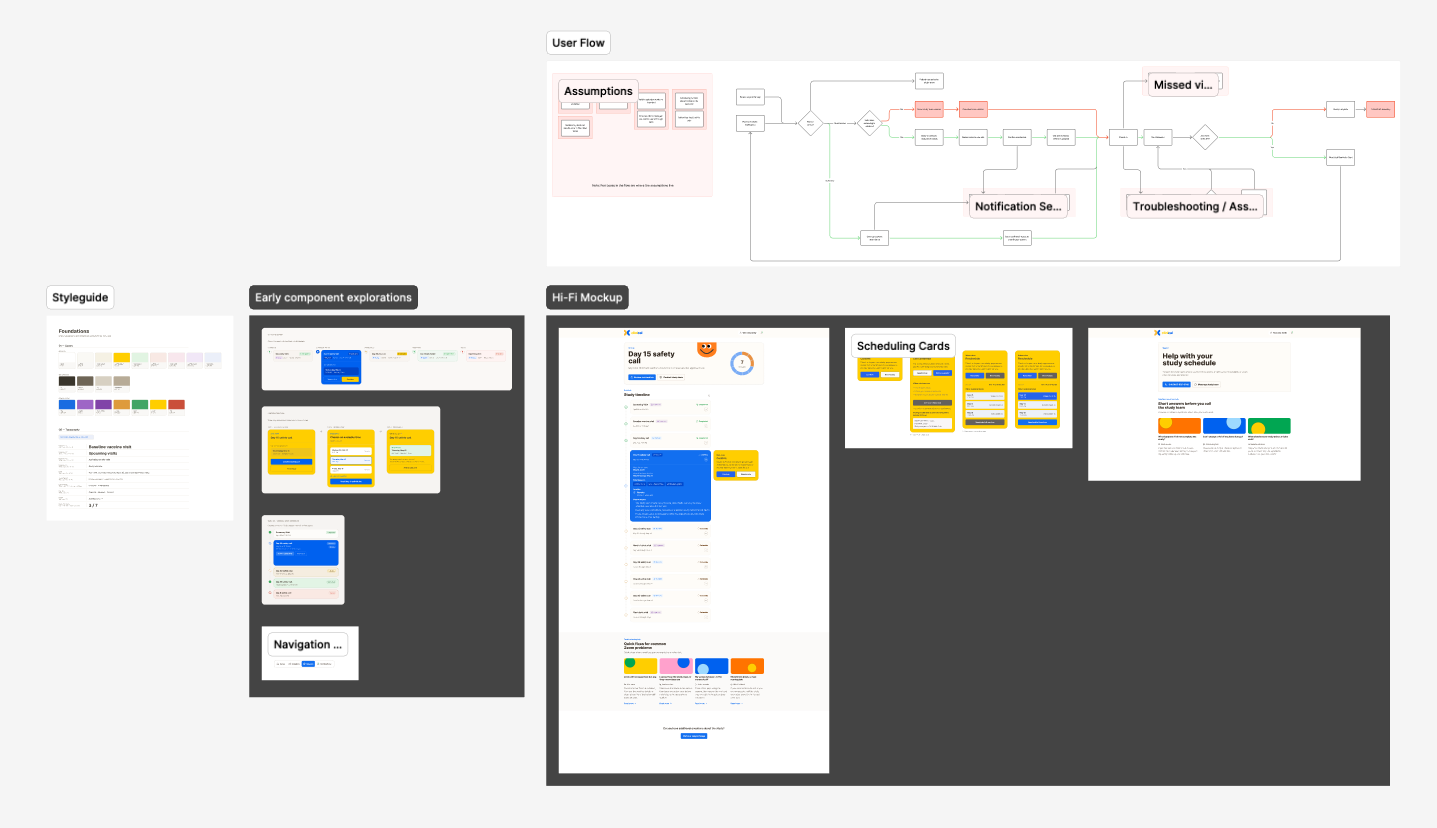
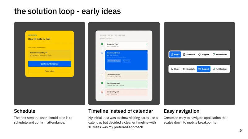
The take-home brief asked for a solution to a medical scheduling application, timeboxed to four hours. I called what I built Clinical. I never found out whether the panel scored that take-home on its own or just folded it into their overall impression of the round. What I can tell you is the structure above: Clinical, presented in five slides, a userflow walkthrough, and a live prototype, immediately followed by defending a past project, in front of the same panel, in the same sitting, with no break to reset in between. If you want the mechanics of how I actually built and delivered that presentation, I wrote about it separately.
A couple of weeks ago I wrote about why interview loops keep growing, and I said something I never went back to explain. I said the loops I’ve sat through as a candidate typically run three to five rounds, and that the first three are where the real evaluation happens: “a portfolio review, a design exercise, a conversation with the hiring manager that actually probes how I think.” I left “a design exercise” sitting there like a receipt I never itemized.
This is the itemized version. Companies call this round a design exercise, a design challenge, a product design challenge, or a whiteboard challenge depending on who wrote the job posting. Whatever the label, it is the round where a company stops asking you to describe your process and starts watching you use it. That is a different skill than presenting a finished case study, and it gets almost none of the prep attention the presentation does. Search panel interview questions or ux designer interview questions the night before and you’ll mostly find generic tips written for HR interviews in any industry, not this specific live, unscripted format.
The three shapes a design challenge takes
The design challenge I went through, plus everything I’ve heard secondhand or read candidates describe on Blind, falls into one of three formats. You’ll sometimes see this called a ux whiteboard challenge specifically in a job posting or recruiter email, even when what you actually get turns out to be one of the other two formats below. They test different things, they carry different stakes, and they reward different kinds of prep.
Live whiteboarding. Thirty to sixty minutes, done in real time, usually over video or in person with an actual whiteboard. You get a prompt, and you are expected to sketch, narrate, and reason out loud simultaneously. Nothing you draw needs to be pretty. This format is really a test of whether you can think in public without freezing, which is a different muscle than thinking alone at your desk.
On-site exercises. Roughly an hour of solo work, usually with a prompt handed to you at the start, followed by a short presentation of your sketches to whoever is in the room. You get more room to think than live whiteboarding gives you, but you still have to defend rough, unfinished work minutes after you made it. That gap, between how fast you had to move and how much scrutiny the result gets, is the hard part.
Take-home exercises. Four to eight hours, done alone, on your own schedule, usually resulting in something closer to a polished deliverable than a sketch. This is the format most likely to reward people with more free time to burn on a single application, which is worth knowing before you agree to one. It is also the format most likely to get exploited. More on that below.
Which one is worse depends entirely on you. If unscripted, live performance rattles you, a take-home plays to your strengths. If you’d rather get it over with in an hour than let a prompt live in your head for a week, live whiteboarding is the kinder version. Ask which format you’re walking into before the interview, not during it.
What the panel is actually scoring
Here’s what surprised me most once I understood how these rounds actually get evaluated. Almost none of it is about whether your final idea was good. A panel already knows, walking in, that thirty or sixty minutes is not enough time to solve a real product problem. What they are scoring is how you move through not knowing the answer yet.
The single most repeated piece of advice I have seen candidates pass around online, more than any framework or template, is embarrassingly simple: ask clarifying questions before you touch the marker. The top comment, with 336 likes, under a femke.design video walking through an Uber whiteboarding challenge breaks that down into three moves. State the problem back in your own words. Ask what is actually in scope and what is not. Repeat your interpretation back to the room before you propose anything. Only then start drawing.
Ask clarifying questions before you touch the marker. The panel is watching whether you earn your first idea, not just whether you have one.
That sequence matters because it is the same sequence a design critique runs on once you are actually employed. Nobody hands a working designer a finished brief and expects a silent nod. Good critique starts with someone restating the problem so the room agrees on what they are solving before anyone touches a solution. A design challenge is a compressed, high-pressure version of that same habit, and panels can tell within the first two minutes whether a candidate has it or is skipping straight to sketching because sketching feels like progress.
The room doesn’t decide by majority
The live panel round has a mechanic almost nobody explains going in, and it is worth knowing before you are sitting in the room. Pinterest’s own careers blog has described how its interview panels reach a decision: every interviewer needs to land on a yes. Not a majority. One dissenting voice does not get outvoted. It triggers a group discussion about why that person saw something the others did not.
That single detail reframes the whole round. You are not trying to be the strongest voice in the room. You are trying to give every person watching you a reason to say yes on their own, because any one of them holding out changes what happens next. A quiet interviewer taking notes in the corner carries exactly as much weight as the person asking the most questions.
It also explains why this format lands harder on some candidates than others. A recurring complaint under that same femke.design video puts it bluntly: “this round is nightmare for the introverts!” I think that’s fair. Presenting a finished case study is rehearsed delivery. You control the pacing, the order, the words. Solving live in front of a panel is none of that. It is unscripted thinking, performed, in real time, for people whose job is to watch you do it.
You are not trying to be the strongest voice in the room. You are trying to give every person watching you a reason to say yes on their own.
When the take-home stops being a test and starts being free labor
Not every version of this round is run in good faith, and it is worth naming the pattern plainly instead of pretending every take-home is reasonable. Multiple threads on TeamBlind describe take-home design challenges that are not timeboxed at all, that ask for high-fidelity work on the company’s actual live product, with a 48-hour deadline and a mandatory follow-up presentation on top of it. Commenters on those threads do not mince words. They call it unethical. They call it free labor. A separate thread flags Hopper’s design challenge for the same pattern: a real product, a quoted time estimate of one to two hours that candidates say runs far longer once you actually sit down and try to do it properly.
That is a different animal than the four-to-eight-hour take-home I described earlier. The tell is not the format. It’s whether the ask is bounded. A reasonable take-home names a time limit and respects it, asks for a concept rather than a shippable feature, and does not lean on your unpaid hours to solve a real backlog item. An unreasonable one dresses up free consulting as an interview step and hopes you are too excited about the role to notice the difference.
If you are staring at a take-home brief that describes the company’s actual product, gives you two days, and expects a polished deliverable plus a presentation, that is information about how the company treats its own people’s time, not just candidates’. You are allowed to decline it and say why.
Reflective Coda
If I could hand every candidate one sentence before they walk into a design challenge, it would be this: spend your first few minutes on the problem, not the solution. Ask what you’re actually solving. Ask what’s in scope. Repeat it back to yourself, or to the room, before you build a single screen. That habit alone puts you ahead of most candidates who rush to sketch their way to looking competent instead of thinking their way there first.
The other half of that same sentence is about knowing when to walk. A design challenge that respects your time looks nothing like a take-home that quietly outsources real product work to unpaid applicants. You can tell the difference before you agree to either one, and you are allowed to ask the question directly: how much time should this take, and is it scored separately from the rest of the loop? A company that can answer both clearly designed this round on purpose. One that can’t is asking you to guess, the same way too many interview loops ask candidates to guess at everything else.
I think back sometimes to that four-hour clock starting the moment I opened the medical scheduling brief, a blank Figma file waiting, more scope in front of me than four hours could reasonably hold. I know now the panel was never just scoring what I shipped by the end. They were scoring the choices I made about what to leave out, the minutes I spent deciding what “in scope” even meant before I dragged a single frame onto the canvas. Once you know that’s the actual test, the clock gets a lot quieter.